


My colleague’s post on “how to increase your flyer conversion by 2000%” briefly mentioned a case in China a few years ago, where Dianping (later merged with Meituan) achieved 22% conversion for its flyering campaign. Some of our friends are asking for more information about how they did it.
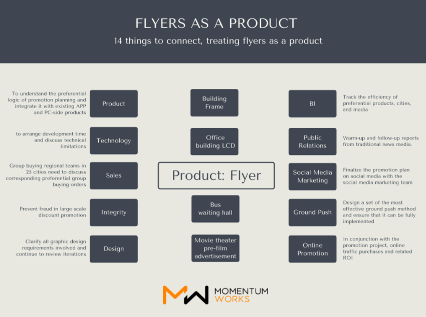
Essentially, they treated the flyer as a product and has a five person team led by the product leader: User communications, Front-end dev, back-end dev, UI design, and data analysis. User needs are analyzed in detail and the journey dissected before resources are allocated and product designed/implemented:
Compared with online products, the planned development cycle is shorter, the market is more uncertain. But in fact, these are problems that product-thinking is good at solving.
You look at the customer journey in different steps, and grasp firmly the parts where any improvement will have the greatest impact on (overall) conversion:
Exploring user journey
A common problem with product newbies is that they like to accumulate cool features in their products.
The common problem of many marketing people is that they like to accumulate FAB (Features, Advantages, Benefits). Below is an example of eCommerce flyer with very low conversion (<0.5%): it is usually printed with a bunch of discounts, such as: “20% off refrigerator!”, “50% off movies!”, “Only for Golden Week in November!”, or “100 get 50!”, and then a dozen discount products were printed on it:
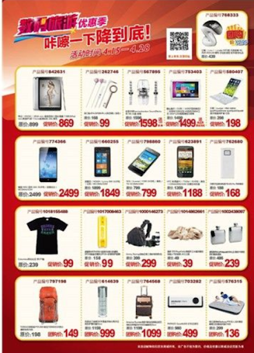
Such designs are all driven by creativity or resources. In other words, it starts from the “resources” owned by the designer. Any ideas will be added, and any FABs will be added to the market. After they are introduced to the market, they will ask again – why are consumers not buying it?
If you ask a product manager to analyze this question, the answer is very simple: because you are not starting from user needs.
Some people might disagree, I give a discount, is it not aimed at user needs?
It’s not. Because user needs are tied to the use case, when she checks out in the supermarket, her need for a 20 yuan voucher, and her need for the same 20 yuan voucher when he sees your advertisement in the lift are Different.
Therefore, product managers all know a word called “use case”, that is, what is the most common scenario when users use the product. Only around this, we can make good products that stick.
Let’s zoom into the small part of “distributing flyers”. The question you need to think about is “In what scenarios do users usually get my flyers?“
So you will find that the scene where the user takes the leaflet needs to be divided into three steps (sub-scenarios): (1) accept/take the leaflet; (2) read the content on the leaflet; and (3) act according to the call-to-action on the leaflet.
In these three steps, the optimization of the first scenario can increase the acceptance rate of flyers and the optimization of the second and third scenarios can increase the conversion rate of flyers. Increase the conversion rate by 3-5 times in each step, and finally, bring a conversion rate of 20-40 times.
The first step: choose to accept flyers
Many people think that the key to handing out flyers is the content of a flyer. In fact, there are at least four important elements in this: the flyer, the person distributing the flyer, the user’s mood, and the environment the user is in.
When users see ground agents distributing flyers, they are often on the rush in shopping malls or CBD areas. They are busy, and their mood towards unfamiliar promoters often amounts to simple resistance/avoidance.
Your “flyer product”—remember, not just the flyer itself, but also the person distributing the flyer, and what the person says – do they fit into this scenario?
Most of the big promotion promoters of O2O companies will try to add 15-30 seconds of words when distributing flyers, for example:
“Hello, I’m from XXX. Now it only costs 5 yuan to download our APP to watch movies. You only need to scan this QR code, then click to download, and then BLAH BLAH BLAH… That’s all. Remember to go back and download it!”
There are three problems with this:
- It reduces the efficiency of the ground push;
- The longer the speech technique, the harder to get the message effectively to the ground promotional agents, which leads to unsatisfactory end results. Relying on personal ability, rather than process and consistency, is never a sustainable strategy;
- As an unfamiliar agent, what you say does not match the mood (or hurried or happy) of the people who normally walk in the streets of the business district. It is conflicting.
How to make a first step that is simple, efficient, easy to teach, and full of emotional resonance? When you think about this scene, the answer comes out:
Just say with a nice smile: “Hello, here is 5¥ of happiness for you” and then turn to another one:
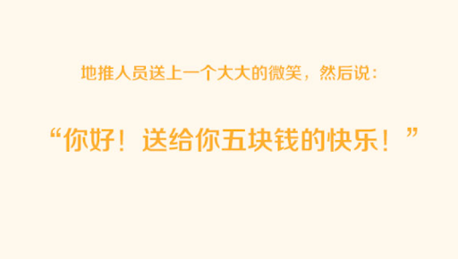
Users often accept it without thinking logically. The fact is that most people decide to accept or not accept the flyer, and it only takes less than 0.3 seconds. Where is the logical thinking? It is all emotionally driven.
Second step: reading the flyer
But “Five Yuan of happiness”- What are you talking about? (Don’t forget that our core discount is actually a five-yuan movie ticket coupon or something).
After receiving the flyer, the user generally does not spend more than 1 second reading the content on the flyer. Think of it this way, and you will quickly understand that the 12 discounted products printed on it plus three lines of discount information are useless.
How do you design a “flyer product” that allows users to decide actions within 1 second? (Hint: There must be no full 12 discount products written on it)
Many marketing people think that CTA (Marketing Term: Call To Action) must be based on discounts. This is a very wrong way of thinking because preferential treatment is a logical concept, and human being is an emotional animal-almost all human action decisions are driven by emotion (quoted from the scientific book “Descartes’ Mistakes” by the neurologist Antonio Damasio in 1994) .
So your CTA should be based on an emotional appeal, not a logical appeal. The existence of all preferential treatments should be to generate an emotion.
Users who receive flyers on the street can be divided into two categories. The first category is the happy state while shopping and the second category is the exhausted/hasty state when they are on the go, on the way to work, or just after getting off work.
Under these two emotions, how does your “product” intervene in their vision to be able to stimulate their action (CTA) within 1 second?
Here is the answer to the product manager who designed the 5 Yuan campaign:
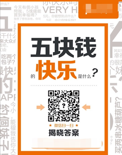
There are no seven or eight discount products. There is no discount. There is no prompt to download the APP. Even the small print around was added by the design team insisting that “it is too ugly to leave that space blank.” In fact, the product manager believes it is distracting.
Some people may ask, but you didn’t even explain the discount, and you didn’t achieve the goal at all!
For each step in the user’s journey, only one message or one instruction is sufficient. The most taboo is trying to tell users five things in one step. This leaves users wondering what to do – confused.
And this flyer is just trying to convey a message that resonates emotionally with the user’s scene within this one second: “Scan this QR code and you will get some happiness.”
The third step: take action
Now the user decides to act.
They are walking on the streets without Wi-Fi, and mobile phone data is valuable (and downloading takes time). Therefore, your “leaflet product” must allow the user to complete the entire operation very easily, smoothly, and simply under such very harsh weather conditions. What would you do?
The traditional O2O e-commerce approach is to let users scan the QR code and then go to the app store to download the APP. This is another approach full of selfish-thinking (“I want you to download our dozens of 100 MB-sized apps”) without taking into consideration the user journey. The end result is most likely extremely low conversion rate.
For this step, the product manager made a simple and effective optimization:
After the user scanned the QR code, he went directly to a local WeChat official account of the campaign. In the introduction of this official account, we finally gave the FAB of “You can watch a movie for 5 yuan”. After the user clicks follow, the first automatic reply of the system is the link to download the APP.
In this way, if the user does not care about the traffic or in the WI-FI environment, he can download it on the spot; or, after he goes to the WIFI environment, he still retains the download link.
In the case that the user forgets, we will remind him to return to this download link by subsequently pushing local life information that is valuable to the user until the final conversion is completed. In addition, as a local life service information provider, you have also established media channels in each local city (from different campaigns), but this is another story.
Most importantly, you have successfully made the user take the first action. “Action” has a bonus effect, which means that if you take the first step and act simply, you will be more likely to make the second step, which is slightly more difficult.
MVP planning and ABCDE testing
Of course, Marketing is not a vision in your head but a science that is tested repeatedly, with a methodology.
Now you just have a product based on your analysis of user scenarios. However, you cannot spread it to 25 cities. Your product design, graphic design, and copywriting design are based on assumptions. Including the analysis above – if there is no positive support from the data of actual rollout, it is wrong.
To ensure you make the right decisions, please only believe in data.
People who make products will throw a lot of cool terms at this time: Minimum Viable Product (Minimum Viable Product, also known as MVP), AB test (small-scale testing of different solutions), grayscale release (let Some users use A, and the other users start to use B. If B is better, then gradually expand the scope and migrate all users to B).
In fact, this is not a particularly new concept. It’s just that relatively few people use it in Marketing. The ability to implement strictly to the end, and do a good job of data tracking and analysis, is even more demanding on the execution of the Marketing team.
In the design of this flyer, the Dianping team conducted a comparison test of five versions in three days, and each version issued 1,000 flyers:
Version 1: The front of the flyer is the discount message of buy 50, get 50 free, and the QR code is the WeChat ID; the back is the traditional super discount display.
Version 2: The front of the flyer is the discount message of buying 50 and getting 50 free, and the QR code is to go to the application market; the back is the traditional super discount display.
Version 3: On the front of the flyer is the title “What is the happiness of five Yuan?” Below is the display of super discount and hot products; the back is the company logo and Slogan
Version 4: There is only “What is the happiness of five Yuan?” on the front of the flyer; the back is a display of super discounts and hot items.
Version 5: The front of the flyer only has “What is the happiness of five Yuan?”; there is no nothing at the back.
For these five versions of the test, because the content is different and the preferential method is different, it requires the design team, the local distribution team, the data analysis team, the procurement team, and the sales team (need to talk about the corresponding hot-selling group orders) to work closely within three days.
The data of the final test results showed that version 5 had the highest conversion rate: 1,000 flyers were sent out, which attracted 223 likes, and 25% of them were converted into downloads that day. The conversion rates of other versions are in single digits.
Dianping team tested version 5 in two cities, and both got 22% conversion. Finally finalized this plan, which is the “very simple” design you saw above. It is not simple at all.
After this “leaflet product” was rolled out to 25 cities, it maintained a conversion rate of 20%. This is surprising data that many promoters who regard “distributing leaflets” as brainless and tasteless activity can hardly imagine.
But through the above sharing, you can see how the Dianping team made it a reality step by step.
People often say such analysis or case study described above is purely in theory, and in reality, it never works. But that’s precisely the point – you need to execute consistently to make it work. Just theory without proper execution will not lead you anywhere.


